
Best Practices for Website Architecture


ATTENTION: Want to Learn Affiliate Marketing from Successful Affiliates?
Effective website architecture lays the foundation for a user-centric experience. A well-structured website helps users navigate effortlessly, leading to higher satisfaction and engagement. To design a seamless website, consider the following Best Practices for Website Architecture:
Understand Your Audience
Put yourself in the shoes of your users. Identify their needs, preferences, and behaviors. Conduct user research through surveys, focus groups, or usability testing to gain insights. Ask questions like:
- What information are they seeking?
- How do they prefer to navigate the site?
- What design elements resonate with them?
Implement a Clear Hierarchy
A logical hierarchy enhances usability. Organize content into categories and subcategories that reflect user priorities. For instance:
- Home
- Products
- Category A
- Category B
- About Us
- Contact
This structure not only helps users find what they need quickly, but it is also effective for search engine optimization (SEO). Ensure that your categories are intuitive and relevant. Check resources like Moz for a deeper understanding of SEO-friendly architecture.
Create a Simple Navigation System
Your navigation menu should be straightforward. Keep it concise with no more than seven top-level menu items. Each item should have clear labels that signify its purpose. Use drop-downs for subcategories but maintain simplicity to avoid overwhelming users.
Optimize for Mobile
With a growing number of users accessing websites on mobile devices, your structure must be responsive. Optimize your site architecture for smaller screens by implementing:
- Collapsible menus that save space
- Touch-friendly buttons for easier navigation
- Fast loading times to improve user experience
For mobile optimization tips, explore the insights provided by Google’s SEO Starter Guide.
Ensure Consistency
Consistency across your website builds trust and familiarity. This includes uniformity in layout, color schemes, and call-to-action (CTA) buttons. When users know what to expect, they are more likely to engage with your content. Develop a style guide that defines your design elements, helping maintain consistency throughout your site.
Utilize Internal Linking
Internal links help users navigate your site and discover related content. These links also enhance SEO by distributing page authority. Create links within your content that point to relevant articles or pages. This encourages users to spend more time on your site, which can positively impact your search ranking.
Use Descriptive URLs
Crafting clear and descriptive URLs not only aids users but also helps search engines understand your content. Avoid complex strings of numbers or random characters. A good URL structure may look like this:
- www.yoursite.com/products/category-a
- www.yoursite.com/blog/title-of-your-article
For more about URL best practices, refer to Yoast SEO.
Regularly Test and Update
Website architecture is not static. Regularly test your site’s usability and gather feedback from users. Use tools like Google Analytics to track visitor behavior and identify areas for improvement. Make updates based on collected data to enhance user experience continually.
| Practice | Description |
|---|---|
| Audience Research | Identify user needs through surveys and usability tests. |
| Clear Hierarchy | Organize content into logical categories and subcategories. |
| Simplified Navigation | Create a concise and intuitive navigation menu. |
| Mobile Optimization | Ensure your site is responsive and user-friendly on mobile devices. |
| Consistency | Maintain uniformity in design elements across the site. |

By adhering to these Best Practices for Website Architecture, you create a user-friendly experience that keeps users engaged. This approach not only benefits your visitors but also boosts your website’s performance on search engines.
The Importance of URL Structures in Website Architecture
URL structures play a significant role in website architecture, influencing how search engines understand and rank your site. A carefully crafted URL can enhance user experience, improve search engine optimization (SEO), and contribute to your site’s overall credibility. Understanding the components of effective URL structures helps you create a site that both you and your users can navigate easily.
Why URL Structure Matters
When aiming for an effective website, consider these factors where URL structure is critical:
- User Experience: Clear and descriptive URLs enhance usability. Users are more likely to click on links that clearly describe the content of the page they direct to.
- SEO Benefits: Search engines use URL structures to categorize content, which can affect your page’s ranking. Well-structured URLs can make your site easier to crawl.
- Sharing and Linking: Simple, memorable URLs are easier to share. Users are more inclined to link to straightforward URLs, enhancing your site’s backlinks.
Key Components of a Well-Structured URL
Consider the following elements when creating URLs:
- Use of Keywords: relevant keywords boosts SEO. A URL like example.com/best-practices immediately tells users about the content.
- Readability: Your URL should be easy to read. Avoid complex strings of letters and numbers. For instance, example.com/article?id=123 is less appealing than example.com/website-architecture.
- Use of Hyphens: Separate words with hyphens rather than underscores. The URL example.com/website-architecture is preferred over example.com/website_architecture.
- Consistent Structure: Maintain a consistent URL structure for similar content. This organization helps search engines understand the relationship between different pages on your site.
Best Practices for Structuring URLs
Implementing best practices can enhance your website’s performance:
- Keep URLs short and straightforward. Ideally, aim for under 60 characters.
- Include a clear hierarchy. A URL like example.com/products/electronics/laptops helps users navigate your site more effectively.
- Avoid unnecessary parameters and session IDs. Clean URLs are easier for both users and search engines to interpret.
- Utilize canonical tags if you have duplicate content. This helps search engines index the preferred version of the page.
Tools and Resources to Manage URL Structures
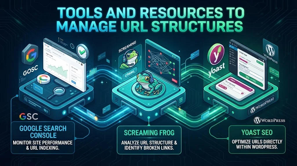
Managing your URL structure can be simplified by using various tools:
| Tool | Function | Link |
|---|---|---|
| Google Search Console | Monitor your site’s performance and URL indexing. | Google Search Console |
| Screaming Frog | Analyze URL structure and identify broken links. | Screaming Frog |
| Yoast SEO | Optimize URLs directly within WordPress. | Yoast SEO |
URL Redirects and Their Importance
URL redirects help in maintaining the integrity of your website:
- 301 Redirects: These permanent redirects inform search engines that your content has moved. It preserves the SEO value of the old URL.
- 302 Redirects: These temporary redirects indicate that the move is not permanent. Use them carefully to avoid confusing search engines.
These practices into your web development strategy can greatly improve your website’s architecture. By investing time in creating a clean and efficient URL structure, you not only enhance user experience but also boost your site’s SEO performance, leading to greater visibility and traffic.
How a Well-Planned Sitemap Enhances Website Navigation
In the digital landscape, effective navigation is crucial for a website’s success. A well-planned sitemap serves as the backbone of intuitive navigation, guiding users effortlessly through your site’s content. By organizing information logically, a sitemap improves user experience and enhances search engine optimization (SEO) efforts. Let’s explore how a carefully crafted sitemap can significantly elevate website navigation.
The Importance of a Well-Structured Sitemap
A sitemap is essentially a blueprint of your website. It categorizes your pages, allowing users to find content quickly. This organization not only benefits visitors but also aids search engines in indexing your site effectively. Here are some reasons why a sitemap is vital:
- Enhances User Experience: With clear pathways, visitors can locate the information they need without confusion.
- Improves SEO: Search engines like Google use sitemaps to identify site structure and prioritize indexing.
- Facilitates Internal Linking: A good sitemap allows for more strategic internal links, promoting page authority.
- Assists with Scalability: As your website grows, a sitemap helps maintain organization.
Key Components of an Effective Sitemap
To create a sitemap that truly enhances navigation, focus on including the following components:
- Clear Hierarchy: Organize pages by category, with primary topics at the top and subcategories beneath. A clear hierarchy helps users understand where they are and how to navigate to their desired content.
- Descriptive Labels: Use meaningful names for each page. Descriptive labels tell visitors what they can expect, making navigation intuitive.
- Accessibility: Ensure the sitemap is easily accessible from anywhere on the site. Common placements include the footer or main navigation menus.
- Regular Updates: Keep the sitemap updated with new content or changes. This keeps both users and search engines informed about the site’s structure.
Implementing Your Sitemap Strategically
Once you have organized your sitemap, it’s key to implement it effectively. Consider the following strategies:
- XML vs. HTML Sitemap: Create both an XML sitemap for search engines and an HTML sitemap for users. The XML sitemap helps with SEO, while the HTML version improves user navigation.
- Incorporate Breadcrumbs: Breadcrumbs provide users with a trail to follow back to previous pages, enhancing usability. They also help Google understand site hierarchy.
- Utilize Search Functionality: Pair your sitemap with a search bar. This feature allows users to find specific information quickly, which can keep them on the site longer.
Testing Your Sitemap
Testing is a crucial step in developing your sitemap. Monitor user behavior and interactions to ensure that your design is effective. Here’s how:
| Action | Goal |
|---|---|
| Analyze Click Paths | Determine how users navigate through your site and where they drop off. |
| Conduct Usability Testing | Gather feedback from real users about their experience navigating the sitemap. |
| Utilize Analytics Tools | Use tools like Google Analytics to assess the effectiveness of the sitemap. |

The Role of Internal Linking in Boosting SEO and User Retention
Internal linking, a crucial part of website architecture, plays a significant role in enhancing both SEO and user engagement. By connecting different pages within your site, internal links guide users through your content, helping them discover more information and stay on your site longer. Effectively using internal linking can lead to higher search engine rankings and improved user retention. Below are some best practices to implement internal linking strategically.
Enhancing SEO with Internal Links
Search engines like Google favor websites that have a well-structured architecture. Internal linking helps search engines understand the relationship between different pages. When you use internal links wisely, they enhance the crawlability of your site, allowing search engines to index your pages more efficiently. Here are some SEO benefits of effective internal linking:
- Improved Page Authority: Each internal link can pass authority from high-ranking pages to lower-ranking ones, boosting their chances of ranking better in search results.
- Better Indexing: Internal links help search engine crawlers find all your web pages. This ensures that even your less prominent pages can be indexed.
- Keyword Targeting: By using relevant anchor text in your links, you can signal to search engines what the linked page is about, improving its relevance for specific keywords.
Boosting User Engagement
While SEO is crucial, user retention is equally important. Internal links guide visitors through your site, keeping them engaged and providing them with a seamless browsing experience. Here’s how internal linking can enhance user engagement:
- Encourages Exploration: By linking related content, you encourage users to explore other articles or pages that they may not have found otherwise. This increases page views and lowers bounce rates.
- Provides Contextual Information: When users find links to related topics, they can gain a deeper understanding of the subject matter, making their experience more enriching.
- Reduces Navigation Time: Well-placed internal links allow users to navigate your site more easily, saving them time and improving their overall experience.
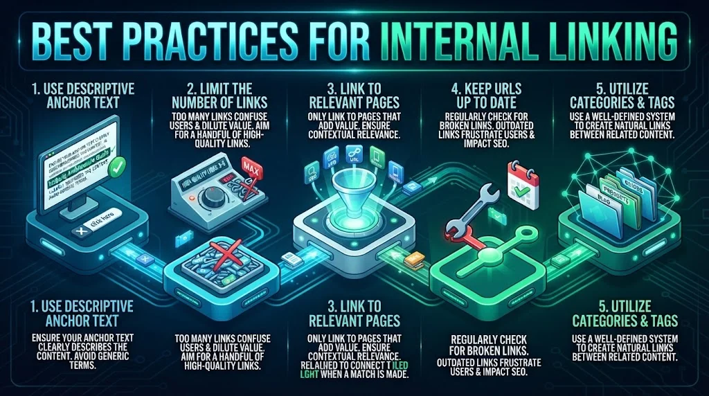
Best Practices for Internal Linking
Here are effective practices to consider when implementing internal linking on your website:
| Practice | Description |
|---|---|
| Use Descriptive Anchor Text | Ensure your anchor text clearly describes the content of the linked page. Avoid generic terms like “click here.” Instead, be specific. |
| Limit the Number of Links | Too many internal links on a single page can confuse users and dilute the value of each link. Aim for a handful of high-quality links that guide users effectively. |
| Link to Relevant Pages | Only link to pages that add value to the reader. Ensure that they are contextually relevant to the content at hand. |
| Keep URLs Up to Date | Regularly check that your internal links are not broken. Outdated links can frustrate users and negatively impact SEO. |
| Utilize Categories and Tags | Using a well-defined category and tagging system can help create natural internal links between related content. |
Tools and Resources
To optimize your internal linking strategy, consider using tools that can analyze your site structure. Some valuable resources include:
- Ahrefs – Offers a suite of tools for SEO analysis, including internal linking audits.
- Moz – Provides insights into SEO best practices, including internal linking strategies.
- SEMrush – Features tools for backlink analysis and internal link optimization.
Implementing an effective internal linking strategy is essential for both SEO and user retention. By mastering internal linking, you can create a more engaging and navigable website that keeps users coming back for more. Prioritize user experience while optimizing for search engines, and you’ll likely see positive results in both traffic and engagement.
Mobile Responsiveness and Its Impact on Website Architecture
In today’s digital landscape, mobile responsiveness plays a crucial role in determining how users interact with websites. As mobile usage continues to rise, businesses must prioritize website architecture that caters to mobile devices. This impacts not only user experience but also search engine rankings. By understanding and implementing best practices in mobile responsiveness, you’ll create a more user-friendly site that can lead to greater engagement and conversions.
One of the key elements that boost mobile responsiveness is flexible grid layouts. A responsive web design employs grids that adjust according to the screen size. Instead of fixed layouts, a fluid grid uses relative units like percentages to ensure that elements scale smoothly across different devices. Here are some best practices you should consider for designing a mobile-friendly grid:
- Use percentage widths rather than fixed values for columns and elements.
- Implement media queries to change styles based on device characteristics.
- Keep your grid system simple—three to four columns generally work best for most designs.
Another important aspect of mobile responsiveness is optimizing images and videos. Large files can slow down loading times, driving away impatient users. Here’s how to ensure your media is mobile-friendly:
- Compress images to reduce file size while maintaining quality.
- Use responsive image techniques such as the srcset attribute to define different sizes for different screens.
- Consider using a Content Delivery Network (CDN) to speed up loading times globally.
Loading speed is critical on mobile devices. Users expect pages to load quickly, and Google’s ranking algorithms give preference to mobile-friendly sites that load within three seconds. To boost your site’s speed, consider these strategies:
- Minimize HTTP requests by combining CSS and JavaScript files.
- Enable browser caching to speed up repeat visits.
- Use asynchronous loading for non-essential scripts.
Navigation design also significantly influences mobile user experience. A well-thought-out navigation structure allows users to find what they need quickly and efficiently. Consider these best practices:
- Simplify your menu options to ensure easy access to the most important sections.
- Implement a hamburger menu to save space while still providing access to all pages.
- Make buttons and links large enough to be easily tapped on mobile screens.
Further enhancing mobile responsiveness involves using touch-friendly elements. Since mobile users navigate with their fingers, ensuring your design elements are touch-friendly is key. Here are some tips:
- Space buttons adequately to prevent accidental clicks.
- Use larger fonts to enhance readability without zooming in.
- Make sure that interactive elements respond to user actions like taps and swipes.
Testing is essential for ensuring that your website architecture is mobile responsive. Utilize various tools to test how your site performs across different devices and browsers. Google’s Mobile-Friendly Test offers insights on how your site measures up, while tools like BrowserStack can simulate various environments.
Keep your website architecture up to date with the latest trends in mobile design. Resources like Smashing Magazine and Web Dev provide excellent insights and research on effective mobile-first design strategies.
Ultimately, implementing mobile responsiveness into your website architecture not only enhances user experience but also aligns with best practices that can boost your SEO performance. By focusing on flexible layouts, optimizing media, accelerating loading times, simplifying navigation, using touch-friendly elements, and rigorously testing your site, you create a mobile-friendly environment that meets your users’ needs and improves your online presence.
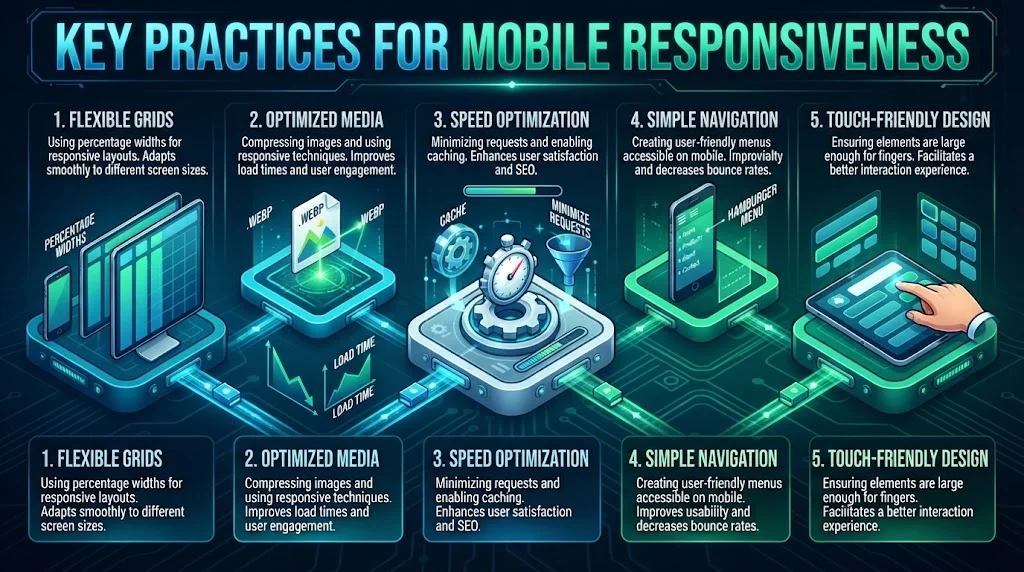
| Key Practices | Description | Benefits |
|---|---|---|
| Flexible Grids | Using percentage widths for responsive layouts. | Adapts smoothly to different screen sizes. |
| Optimized Media | Compressing images and using responsive techniques. | Improves load times and user engagement. |
| Speed Optimization | Minimizing requests and enabling caching. | Enhances user satisfaction and SEO. |
| Simple Navigation | Creating user-friendly menus accessible on mobile. | Improves usability and decreases bounce rates. |
| Touch-Friendly Design | Ensuring elements are large enough for fingers. | Facilitates a better interaction experience. |
Conclusion
A well-structured website is essential for providing an excellent user experience and improving your search engine visibility. When you prioritize user needs in your website architecture, you create a more enjoyable and efficient online environment. Clear URL structures play a key role in this process, making it easier for visitors and search engines to navigate your content. A thoughtfully designed sitemap further enhances navigation, allowing users to find what they’re looking for quickly and effortlessly.
Internal linking should not be overlooked as it aids both SEO and user retention. By connecting related content within your site, you guide users to explore more of what you have to offer, keeping them engaged and on your site longer. This interconnectedness not only enriches user experience but also signals to search engines that your content is relevant and valuable.
Furthermore, with the increasing use of mobile devices, ensuring your website is responsive is more critical than ever. A mobile-friendly design allows users to access your content seamlessly, regardless of the device they’re using. This adaptability not only enhances user satisfaction but also positively impacts your site’s ranking in search results.
Taking the time to implement these Best Practices for Website Architecture offers significant benefits. You can create a site that is easy to navigate, optimized for search engines, and, most importantly, fulfills the needs of your users. By focusing on these elements, you set the groundwork for a successful online presence that attracts and retains visitors effectively.