 ATTENTION: Want to Learn Affiliate Marketing from Successful Affiliates?
Join this FREE community where successful marketers share their secrets!
Learn directly from highly successful affiliate marketers
Access free, actionable training content regularly
Connect with an active community of over 5,000 members
Network with multiple six-figure earning affiliates
Get your questions answered by real experts
JOIN FREE NOW!
ATTENTION: Want to Learn Affiliate Marketing from Successful Affiliates?
Join this FREE community where successful marketers share their secrets!
Learn directly from highly successful affiliate marketers
Access free, actionable training content regularly
Connect with an active community of over 5,000 members
Network with multiple six-figure earning affiliates
Get your questions answered by real experts
JOIN FREE NOW!
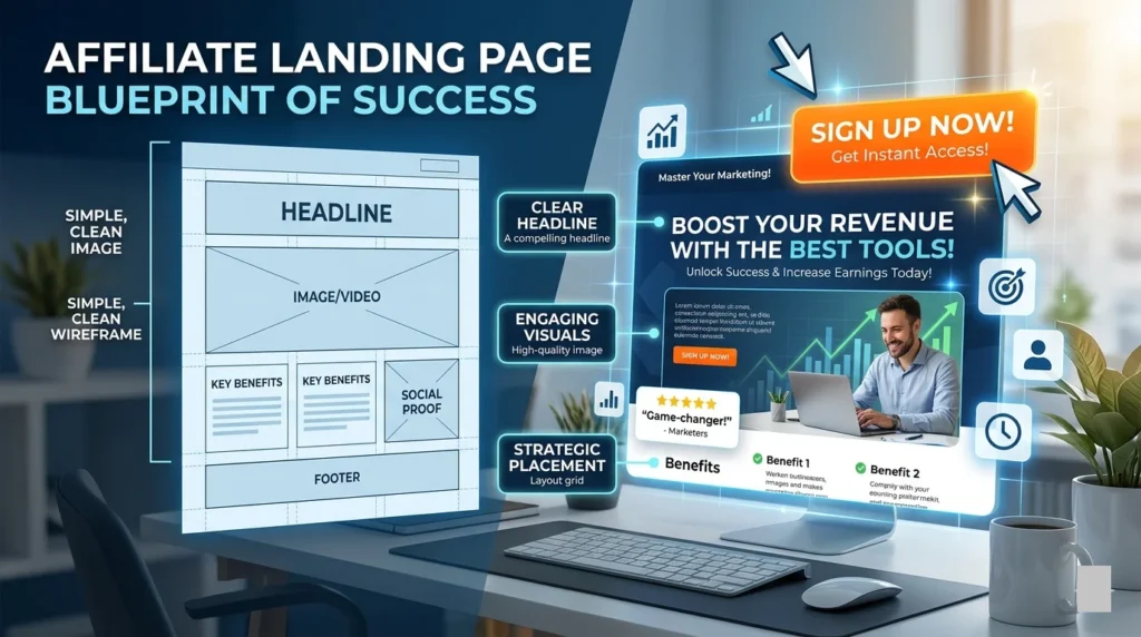
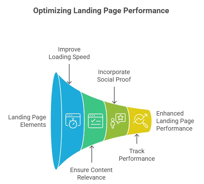
Creating an effective affiliate marketing landing page is essential for successful conversions. Your landing page is often the first impression potential customers have of your offer. To increase the likelihood that a visitor will take the desired action—like subscribing to a newsletter, purchasing a product, or signing up for a service—you need to focus on their experience. Here are some key elements to consider when building your landing page.
Clear Call-to-Action (CTA)
Your call-to-action should stand out and communicate exactly what you want the visitor to do. Use action-oriented words like “Get Started,” “Sign Up Now,” or “Claim Your Offer” to make it clear and compelling. Ensure your CTA button is visually distinct; consider using contrasting colors or larger fonts to draw attention. Place your CTA strategically throughout the page, not just at the bottom.
Compelling Headline
The headline is the first thing visitors will see, so make it count! A strong headline should grab attention and convey the key benefit of your offering. Use numbers or questions to pique interest. For instance, “Unlock 50% Off on Your First Purchase!” immediately tells the reader what they will gain.
Engaging Visuals
High-quality images or videos can significantly enhance your landing page. They should relate directly to your offer and evoke the intended emotions. For example, if you promote a travel service, vibrant, stunning images of destinations can entice visitors. Ensure that visuals load quickly to avoid frustrating users.
Relevant Testimonials
Social proof can build trust. Including testimonials from satisfied users can showcase the effectiveness of your offer. Use clear, authentic quotes, and include photos when possible. This makes the testimonials feel more genuine. Consider also adding average ratings or icons for easier consumption of the information.
Benefits Over Features
When describing your product or service, focus on benefits rather than features. Explain how your offer solves a problem or improves the user’s life. For instance, instead of saying “Our software has a user-friendly interface,” you might say “Easily streamline your tasks and save hours of work each week.” This approach resonates better with visitors.
Simple, Clean Design
Your landing page design should be clean and free of clutter. Avoid overwhelming visitors with excessive information or distracting elements. Ensure there is ample white space to allow your content to breathe. Consider using bullet points to make the text more digestible and easier to scan.
Optimized for Mobile
With the increasing number of users accessing websites via mobile devices, it is crucial that your landing page is mobile-friendly. This includes fast loading times, easy navigation, and clear CTAs. Use responsive design techniques to ensure your page looks great on any device.
A/B Testing
A/B testing allows you to experiment with different versions of your landing page to see which one performs better. You might test different headlines, images, or CTAs. Track conversions for each version to understand what resonates most with your audience. Use the data to refine your approach continually.
Analytics and Tracking
Implement analytics tools to monitor the performance of your landing page. This data can provide insights into user behavior, such as where they click or where they drop off. Tools like Google Analytics can help you gather this information, enabling you to make data-driven decisions.
Secure and Trustworthy
Security is a significant concern for online shoppers. Make sure your website uses HTTPS to protect customer data. Display trust badges or guarantees to further reassure visitors. For example, a money-back guarantee can enhance your offer’s appeal and reduce purchase anxiety.
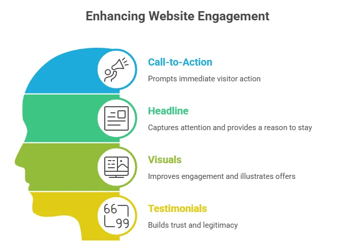
| Element | Purpose |
|---|---|
| Call-to-Action | Encourages immediate action from visitors. |
| Headline | Grabs attention and gives a reason to stay. |
| Visuals | Enhances engagement and illustrates offers effectively. |
| Testimonials | Builds trust and legitimacy for your offering. |
Implementing these effective elements will significantly enhance the performance of your Affiliate Marketing Landing Page Tips. By focusing on user experience and optimizing each aspect, you can increase your chances of achieving higher conversion rates. For more insights, check out resources like WordStream or Neil Patel’s blog for strategies on improving your landing pages.
Analyzing Successful Examples of Affiliate Landing Pages
In the ever-evolving world of affiliate marketing, landing pages play a pivotal role in capturing audience interest and driving conversions. By analyzing successful examples of affiliate landing pages, we can identify key elements that contribute to their effectiveness. Here are some features commonly found in high-converting affiliate landing pages.
Clear Call to Action (CTA)
A compelling CTA is one of the most critical elements of any landing page. Successful affiliate landing pages typically employ strong and clear CTAs that tell visitors exactly what they should do next. Words like “Get Started Now” or “Claim Your Offer Today” create urgency and encourage potential buyers to take action right away.
Strong Visual Components
Visual content grabs attention and helps convey messages more effectively. Successful landing pages often incorporate:
- High-quality Images: These showcase the product prominently and create an emotional connection.
- Videos: Short, engaging videos can explain the product’s benefits in a visually appealing way, often leading to higher engagement.
- Infographics: These summarize complex information and can make comparisons easier for consumers.
Benefits-Focused Copy
Successful landing pages excel at highlighting benefits rather than just features. They answer the crucial question: “What’s in it for me?” Here’s how effective copy usually gets structured:
- Clear Headline: The headline should quickly communicate the unique selling proposition.
- Subheading: This should elaborate on the headline, explaining why the offer is compelling.
- Benefits List: Bullet points can succinctly outline the benefits, making it easy for the reader to scan the content.
Social Proof and Testimonials
People tend to trust the experiences of others. Successfully executing this principle, affiliate landing pages often include:
- User Testimonials: Real users sharing their positive experiences build trust.
- Star Ratings: ratings from existing users adds credibility and encourages new visitors to buy.
- User Counts: Expressing how many people use the product can be persuasive.
Mobile Optimization
With a significant amount of traffic coming from mobile devices, ensuring that your affiliate landing page is mobile-friendly is crucial. Successful landing pages often feature:
- Responsive Design: This ensures the page looks good on all devices, including smartphones and tablets.
- Fast Load Times: pages should load quickly to reduce bounce rates.
Strategic Use of Colors
The choice of colors influences user behavior. Successful landing pages typically use:
- Contrasting Colors: These draw attention to CTAs and crucial information.
- Brand Colors: Colors consistent with the brand help enhance recognition and loyalty.
Effective Use of Whitespace
Whitespace helps to create a clean and organized layout, making the content easier to digest. Successful landing pages utilize whitespace to improve:
- Readability: Important content stands out and guides readers’ eyes naturally.
- Focus: It keeps users from feeling overwhelmed by too much information.
Regular Optimization
The best affiliate landing pages are not static; they are continuously updated and optimized based on performance metrics. Keeping an eye on data such as conversion rates and user behavior provides insights into what works and what doesn’t. Consider testing different headlines, CTAs, and layouts through A/B testing to find the most effective combination.
The Role of Call-to-Action Buttons in Conversion Rates
When it comes to converting visitors into customers, the design and placement of call-to-action (CTA) buttons play a critical role. These buttons act as signposts guiding users toward taking the desired action, whether it’s signing up for a newsletter, downloading an eBook, or making a purchase. Let’s explore how effective CTA buttons can significantly impact conversion rates.
Importance of CTA Buttons
CTA buttons serve as the interface through which your audience interacts with your content. Their visibility and clarity can either entice visitors with a seamless path to conversion or confuse them, causing potential leads to slip away. Here are some key reasons why CTA buttons are essential:
- Direction: They provide clear directions on what the next step is.
- Urgency: Well-crafted CTA buttons can instill a sense of urgency, encouraging visitors to act promptly.
- Engagement: Eye-catching buttons can grab user attention, increasing the likelihood of engagement.
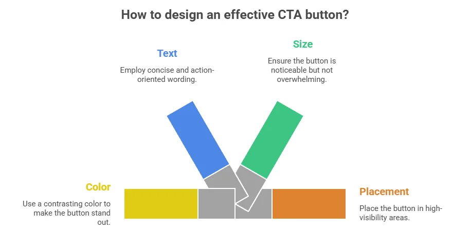
Key Elements of an Effective CTA Button
| Element | Description |
|---|---|
| Color | Choose a color that stands out from your website’s palette, making the button easily identifiable. |
| Text | The wording should be concise and action-oriented. Phrases like “Get Started,” or “Claim Your Discount” create a clear call to action. |
| Size | Buttons should be large enough to be noticed but not overwhelming. There should be enough white space around them for clarity. |
| Placement | Ideal placement can vary; however, above the fold and at the end of valuable content are common hotspots. |
Best Practices for Optimizing CTA Buttons
Here are actionable tips to enhance the performance of your call-to-action buttons:
- Test Different Variations: A/B testing different colors, sizes, and texts can reveal which configurations resonate most with your audience.
- Create Urgency: Phrases like “Limited Time Offer” or “Act Now!” can compel users to take action quickly.
- Use First-Person Language: Instead of “Download,” try “Download My Free Guide” to make the CTA feel personalized.
- Ensure Mobile Compatibility: With an increasing volume of mobile users, ensure your CTA buttons are easy to tap on smaller screens.
Continual Improvement
To keep enhancing your CTA button effectiveness, it’s important to regularly analyze the data. Factors such as click-through rates, conversion rates, and user feedback can provide valuable insights that will allow you to make informed adjustments. Always be open to tweaks and new strategies based on performance metrics.
How to Optimize Your Landing Page for Mobile Users
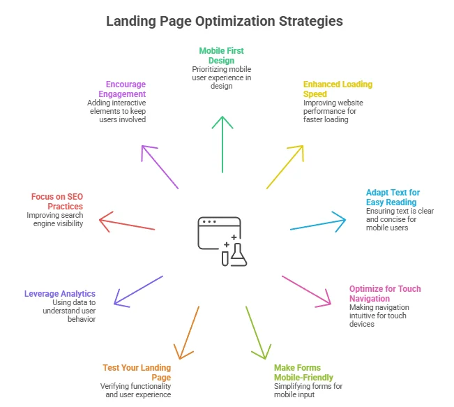
Ensuring your landing page is optimized for mobile users is vital in today’s digital landscape. With the majority of users accessing websites through their smartphones, creating a seamless mobile experience can significantly boost conversions. Here are some practical tips to enhance your landing page’s mobile optimization.
Design for Mobile First
Start by designing your landing page with mobile users in mind. A mobile-first approach ensures that you prioritize critical elements that capture attention. Use a single-column layout, limit the amount of text, and make your call-to-action (CTA) buttons finger-friendly. Here are some aspects to consider:
- Use large, touch-friendly buttons (at least 44×44 pixels).
- Limit the number of images to accelerate loading times.
- Avoid heavy graphics that can disrupt mobile performance.
Enhanced Loading Speed
Loading speed is crucial for retaining mobile users. A fast landing page improves user experience and reduces bounce rates. Consider these techniques to enhance your page speed:
- Compress images to lower file sizes.
- Utilize browser caching to store data for quicker access.
- Minimize JavaScript and CSS files.
Adapt Text for Easy Reading
Text readability on mobile devices is essential. Use a font size that is easy to read without zooming. A general guideline is to use a minimum font size of 16px for body text. Make sure you have ample spacing between lines and paragraphs to avoid clutter. Consider using a hierarchy in text (headings, subheadings) to enhance scannability.
Optimize for Touch Navigation
With touch screens being the primary interaction method on mobile, make sure that navigation is intuitive. Here are some tips for improved touch navigation:
- Place navigation menus in familiar locations (usually top or bottom of the screen).
- Implement a sticky header that remains visible while scrolling.
- Provide clear indications (like hover effects) that buttons are clickable.
Make Forms Mobile-Friendly
Forms can often be a bottleneck in mobile conversions. Simplify your forms by minimizing the number of fields. Here are some additional tips:
- Use input masks and dropdowns to simplify data entry.
- Label fields clearly to prevent user confusion.
- Consider offering options like ‘One Click’ login through social media accounts.
Test Your Landing Page
Regular testing and adjustments are key to mobile optimization. Use tools like Google’s Mobile-Friendly Test or GTmetrix to analyze your landing page’s performance. Ensure to check how it looks across various devices and screen sizes.
Leverage Analytics
Utilize analytics tools to monitor user behavior on your mobile landing pages. Understand where users are dropping off and identify which elements are performing well. Platforms like Google Analytics provide insights that can guide your optimization efforts.
Focus on SEO Practices
Mobile optimization isn’t only about design, but also about ensuring that the page ranks well in search engines. Implement the following SEO practices to enhance visibility:
- Utilize local SEO strategies if applicable, as many mobile users are searching for localized content.
- Use mobile-specific keywords without compromising content quality.
- Optimize meta tags and descriptions specifically for mobile users.
Encourage Engagement with Mobile-Responsive Features
Integrate features that engage mobile users, such as:
- Incorporate videos that load fast and can be played without buffering.
- Add social sharing buttons, making it easy for users to share content directly.
- Utilize chatbots or live chat to assist users in real-time.
By following these mobile optimization strategies, you can create a landing page that not only captures user attention but also encourages action. Remember to make adjustments regularly based on user feedback and analytics data. With a user-centric design and performance focus, you can significantly enhance your mobile landing page’s effectiveness. For more information on optimizing your landing page, visit Moz and Neil Patel to learn more.
Common Mistakes to Avoid When Creating an Affiliate Landing Page
Creating an effective affiliate marketing landing page requires attention to detail. While it’s easy to focus on the technical aspects, some common mistakes can hinder your success. Avoiding these pitfalls will greatly improve your chances of converting visitors into customers.
One significant error is having a cluttered design. A landing page should have a clear focus. If your page is overflowing with too many images, text, or colors, it can overwhelm visitors. Keep your design minimalistic. Choose a simple color scheme and use whitespace efficiently to guide the eye toward important elements.
Another common mistake is neglecting the importance of a strong headline. Your headline is the first thing visitors will notice, so it should grab their attention immediately. Make it compelling and relevant to the offer. targeted keywords can also help with search engine optimization. Remember, a good headline sets the tone for the entire page.
People often forget to optimize their landing page for mobile users. With a vast number of people browsing on their phones, it’s essential that your page looks great and functions well on mobile devices. A responsive design ensures that all your content is easily accessible, regardless of the screen size.
Don’t overlook the power of a clear call to action (CTA). Your CTA should stand out. Use contrasting colors and a persuasive message to encourage users to take action. Phrasing like “Sign Up Now” or “Get Your Free Trial” can create urgency. A/B testing different CTAs can help determine which resonates best with your audience.
Here’s a list of additional mistakes to consider:
- Ignoring loading speed: A slow-loading page can cost you potential leads. Optimize images and use streamlined code to improve speed.
- Using irrelevant content: Ensure all content on your landing page aligns with your offer. Irrelevant information can confuse visitors and lead to high bounce rates.
- Forgetting social proof: Testimonials and reviews can enhance your credibility. Features like customer feedback or success stories build trust.
- Not tracking performance: Regularly monitor your landing page’s performance with analytics. This will help identify what works and what needs improvement.
Another common oversight is having too many links. A landing page should direct visitors towards one primary action. Multiple links can distract and lead them away from your goal. Limit the navigation options to keep users engaged.
Consider the importance of form fields as well. If you’re asking visitors to input information, ask for only what’s necessary. Long forms can deter potential leads. A concise form that only requires essential details can increase conversions.
Additionally, ensure that your value proposition is clear. Visitors should instantly understand what they gain from your offer. Whether it’s a discount, a free trial, or exclusive access, make it evident why they should take action. Using high-quality images can also influence your page’s success. Professional visuals help to enhance the overall appeal and can convey your message effectively. Avoid stock images that feel generic. Opt for authentic visuals that resonate with your target audience.
Understanding your audience can drastically affect your page’s performance. Research their needs and preferences. Tailoring your message to what your audience cares about creates a more engaging experience.
Don’t forget about SEO. Include relevant keywords naturally throughout your content. This can improve your page’s visibility in search engine results, leading to increased traffic. Use tools like Moz to help optimize your keywords.
By avoiding these common mistakes, you pave the way for a successful affiliate marketing landing page. Remember, each element plays a significant role in driving conversions. Take the time to refine your approach, and you will likely see positive results.
Conclusion
Creating an effective affiliate marketing landing page is about putting the needs of your visitors first. By incorporating essential elements such as clear headings, engaging visuals, and testimonials, you can foster trust and encourage users to take action. Analyzing successful examples can give you insights into what works; mimic their strategies while adding your unique touch to stand out.
Call-to-action buttons play a critical role in guiding users toward conversion. Make sure these buttons are prominent, action-oriented, and strategically placed to maximize their impact. Additionally, optimizing your landing page for mobile users is essential in today’s digital landscape, as a mobile-friendly design can significantly enhance user experience and boost your conversion rates.
While developing your landing page, avoid common pitfalls such as clutter, long load times, and vague messaging. Keeping your content focused and clear will not only engage your audience but also help to maintain their interest throughout their visit. Always prioritize ease of navigation and clarity to enhance user interaction.
Ultimately, the goal is to create a landing page that resonates with your audience and addresses their needs. By following these Affiliate Marketing Landing Page Tips and regularly refining your approach, you can craft an affiliate marketing landing page that drives conversions and maximizes your earning potential. Remember, every small detail counts, so invest time and effort into making your landing page the best it can be.